Mindvalley

Mindvalley is one of the world's largest personal transformation platforms: over 110 programs (called Quests), specialised degree-style Masteries, live events, and coaching certifications, taught by worldrenowned instructors and delivered across web, mobile, and app. Founded in 2005 by Vishen Lakhiani, it has grown from a course publisher into a full ecosystem spanning meditation, fitness, entrepreneurship, spirituality, and relationships, all under a single membership. Mindvalley already had a category system in place before Shapes was brought in. It sorted content into life areas and used colour to tell them apart. The problem wasn't the idea, it was the execution: the system had never been fully resolved, and it showed.
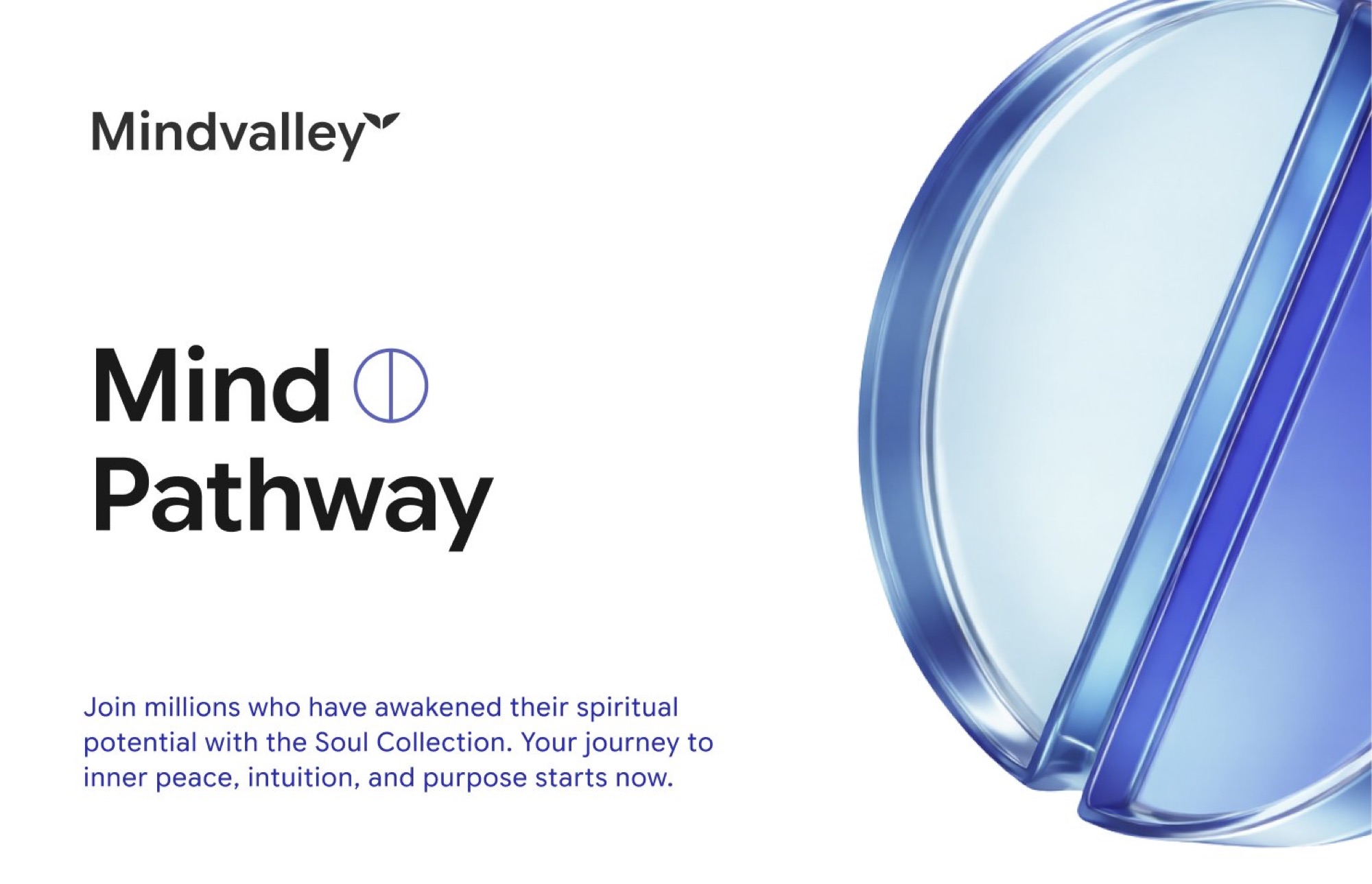
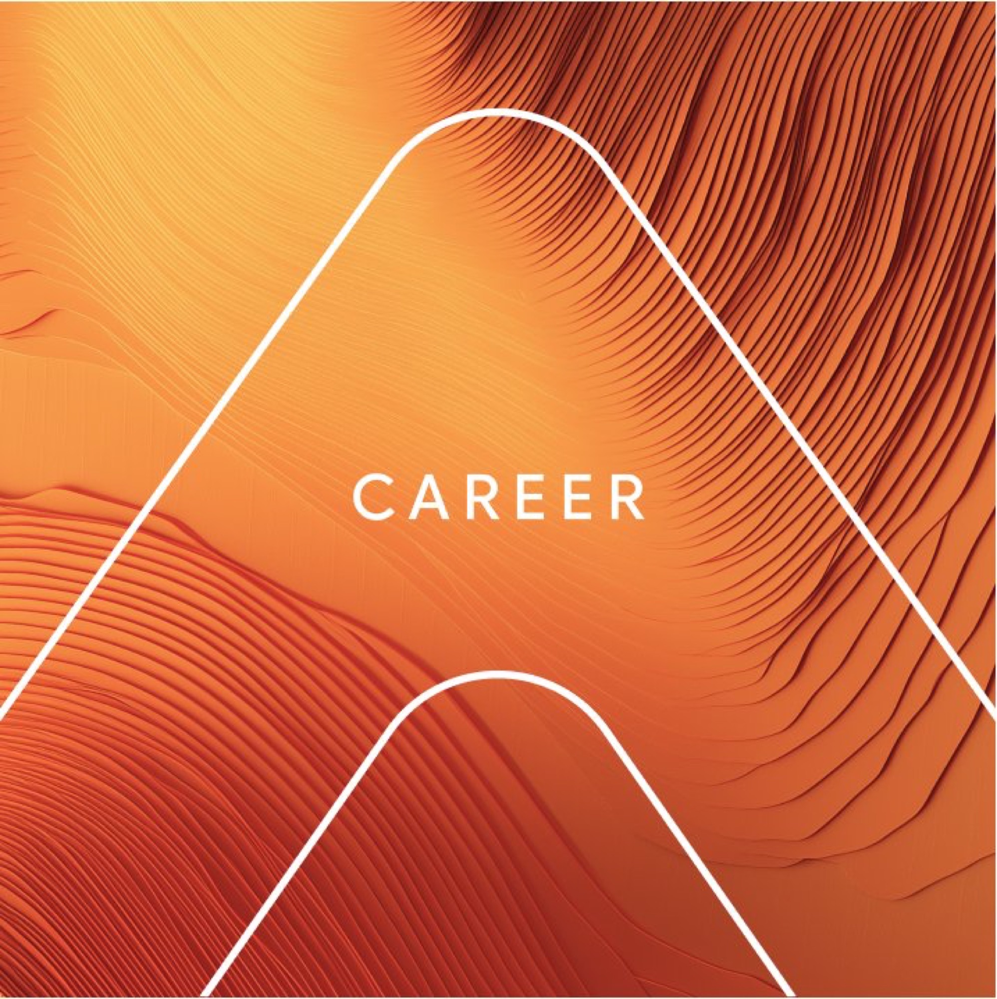
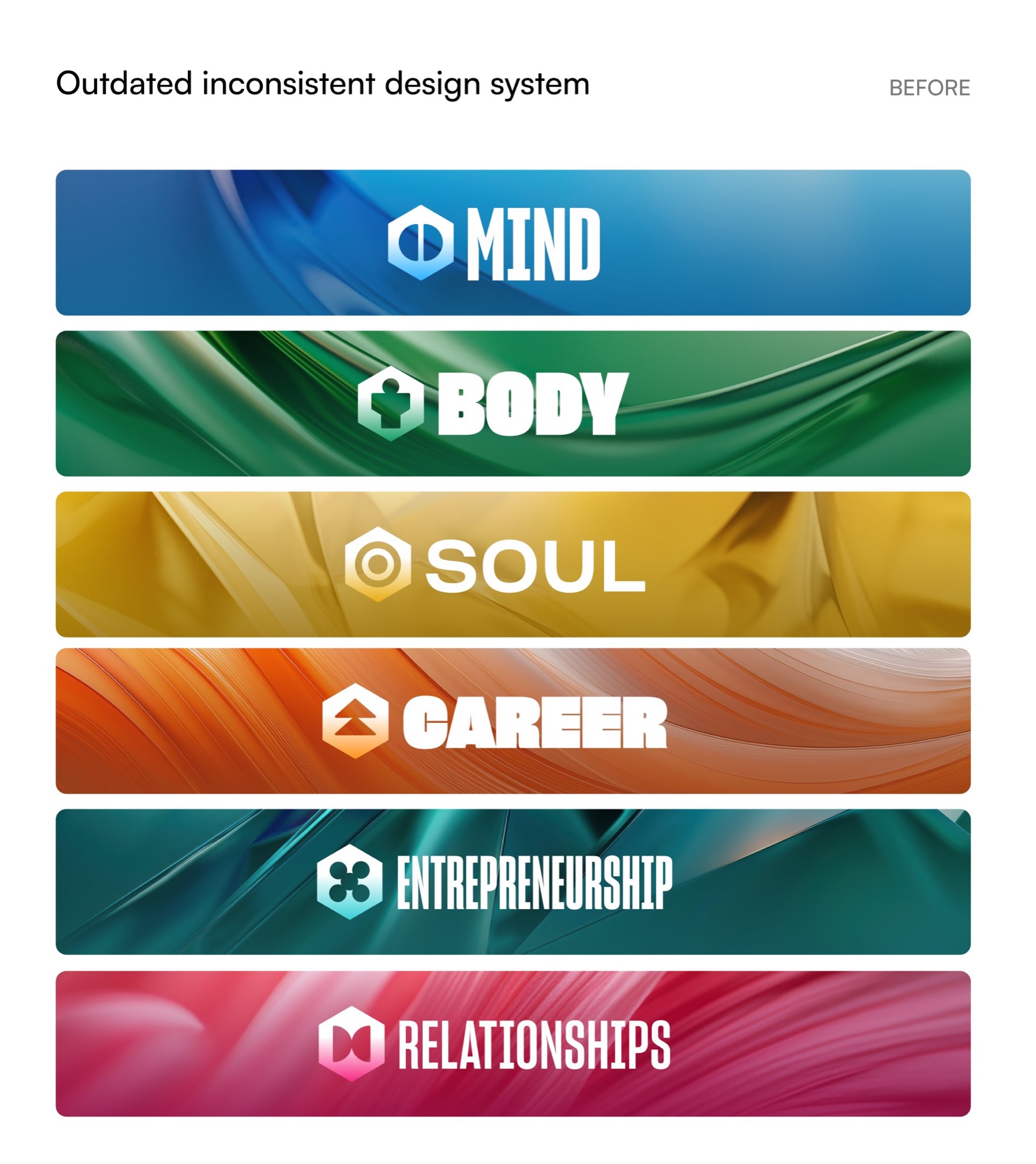
The existing system split content into six to eight categories, Mind, Body, Soul, Career, Entrepreneurship, Relationships, Parenting, and Partner Programs, with real overlap between several of them (Career and Entrepreneurship, Relationships and Parenting). Each category was represented by a generic glossy, liquid-glass 3D wave render in that category's colour: visually striking on its own, but nearly interchangeable from category to category once you took the colour away. The supporting icon system hadn't been settled either, and program thumbnails within each category grid mixed illustration styles, stock photography, and plain text cards, so even a single category page felt visually inconsistent.
Mindvalley's breadth is its biggest strength and its biggest design problem: a sleep meditation, a negotiation course, and a relationship program are all Mindvalley, but they are emotionally nothing alike, and the existing category system, unresolved and overlapping. The task was to make the decisions that system had deferred: which categories actually deserved to be distinct pillars, what the icon language should be once and for all, and how to bring consistency to the story and narrative, as well as reimagining the Mindvalley wordmark and ecosystem as a whole.
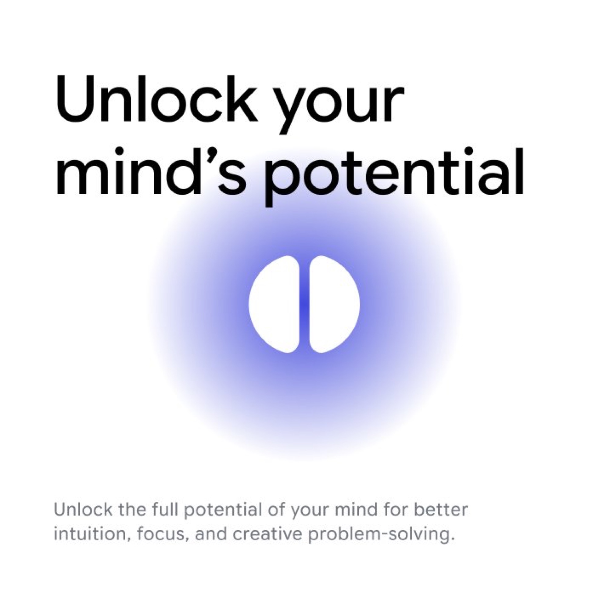
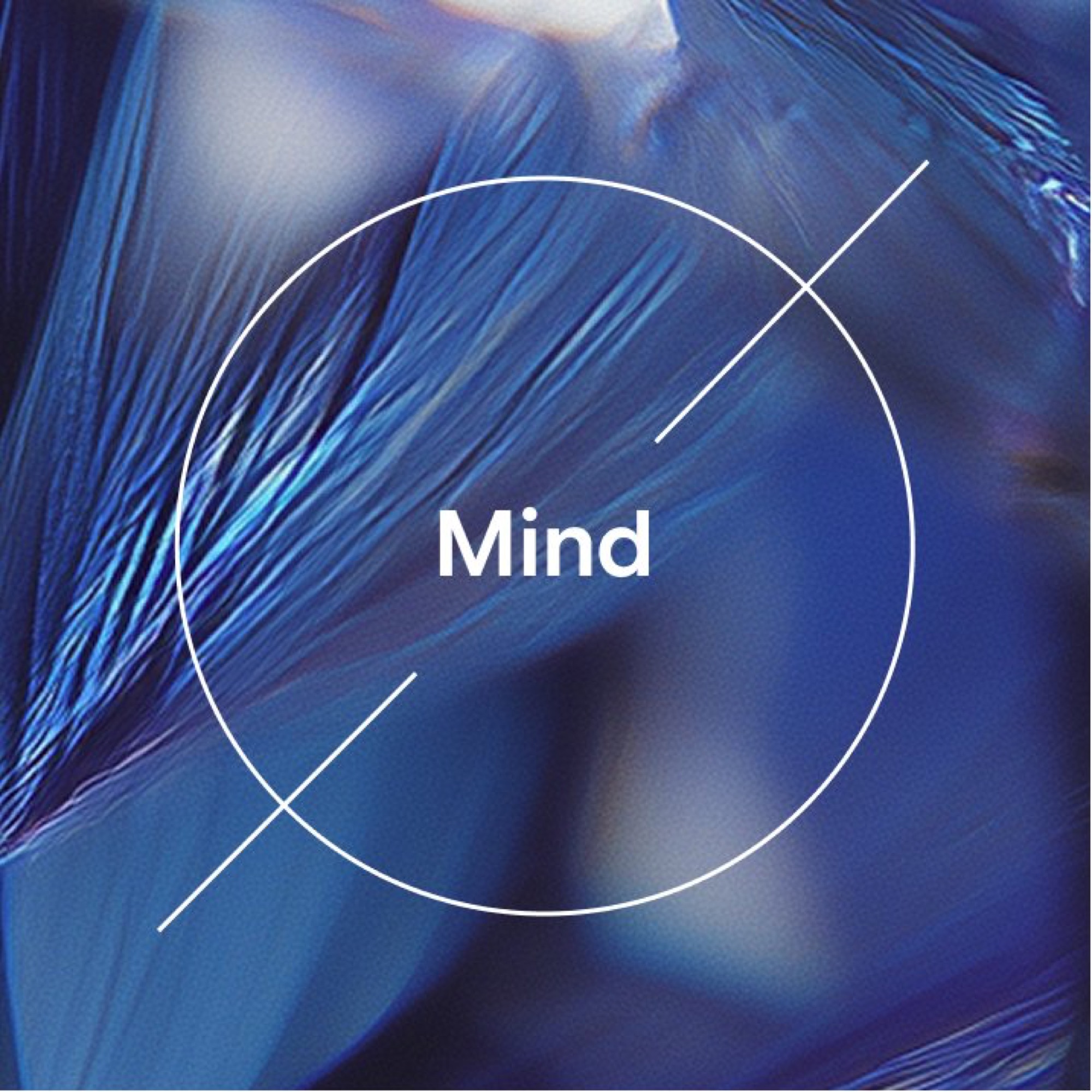
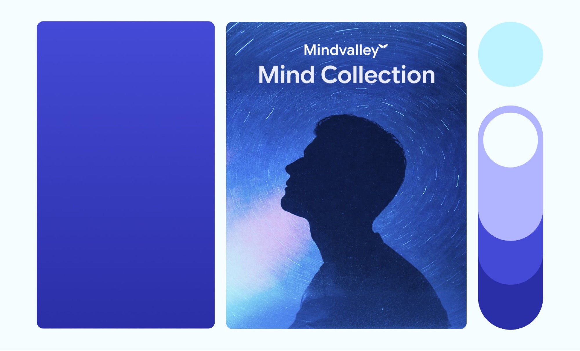
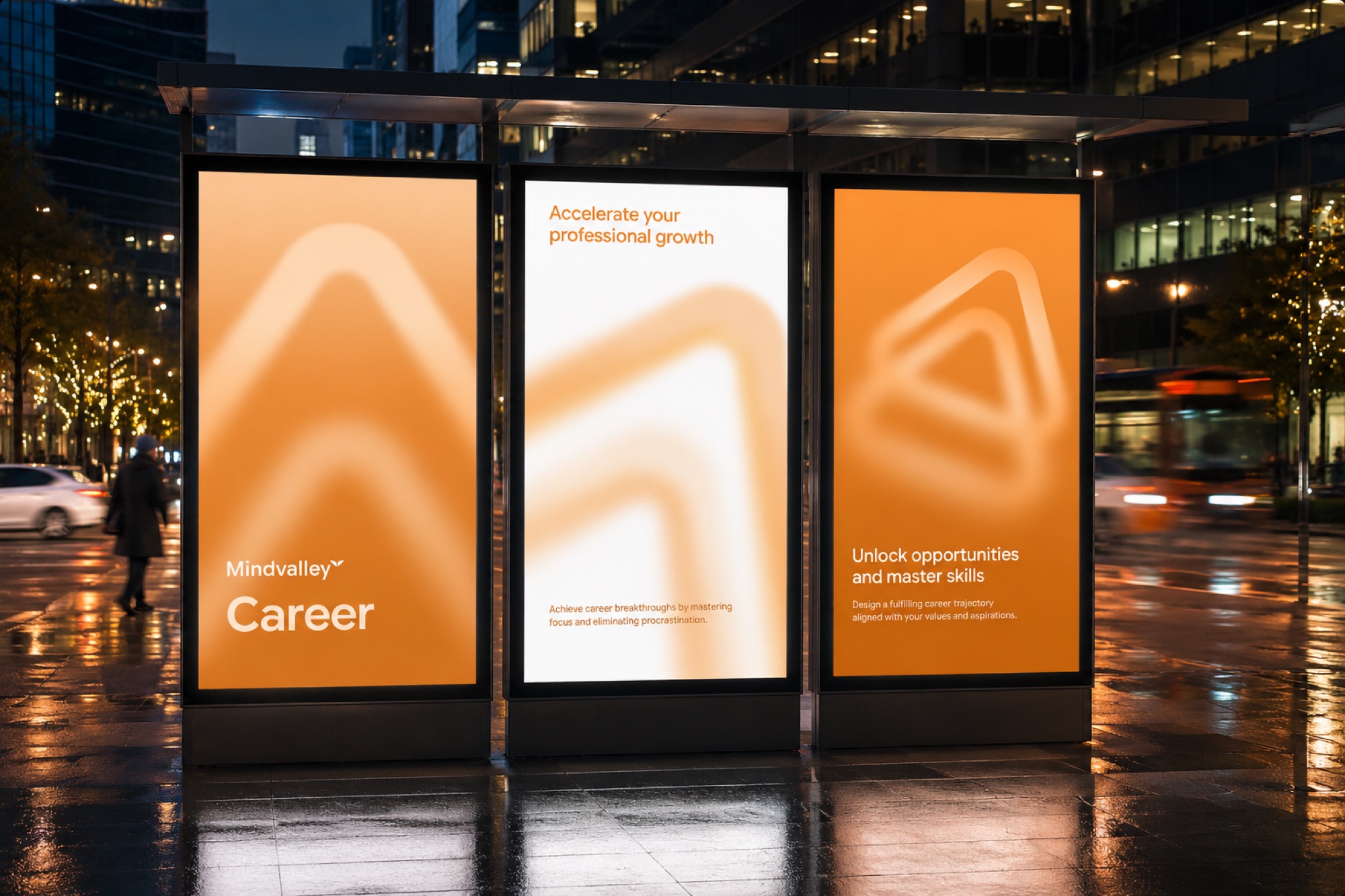
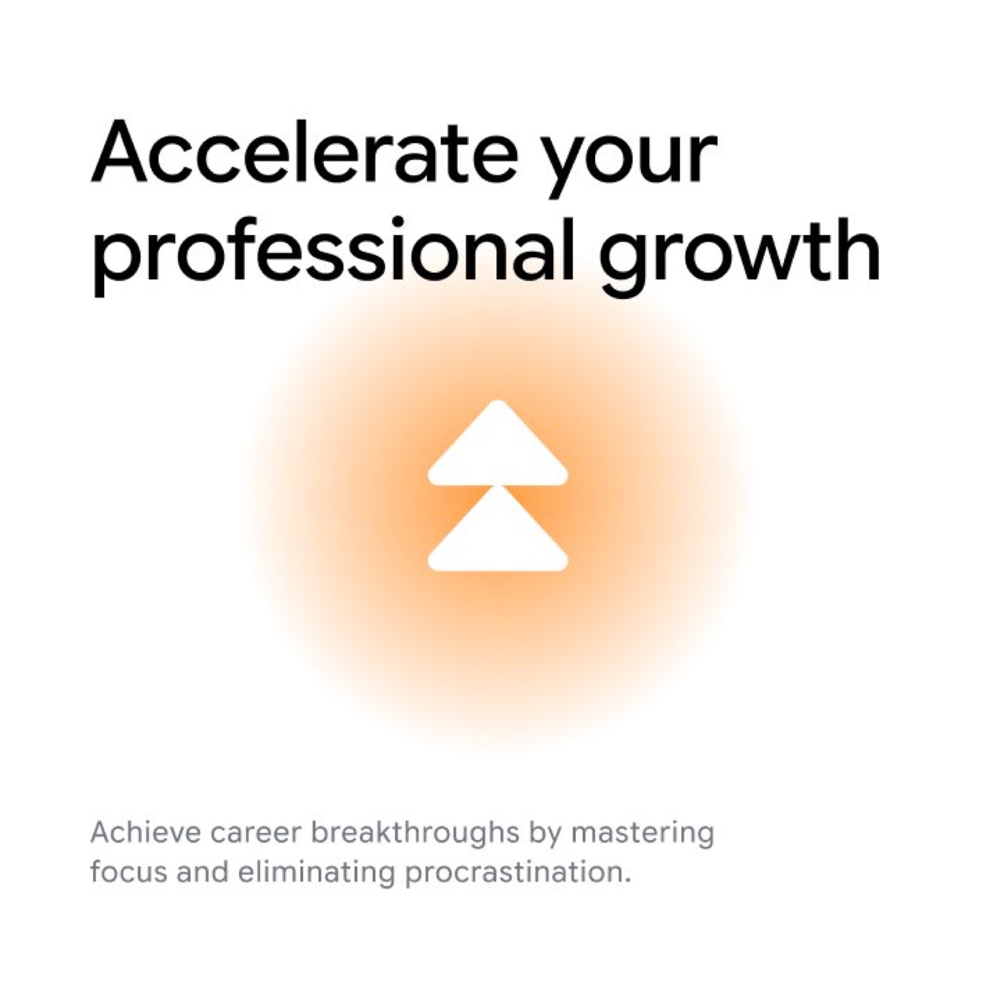
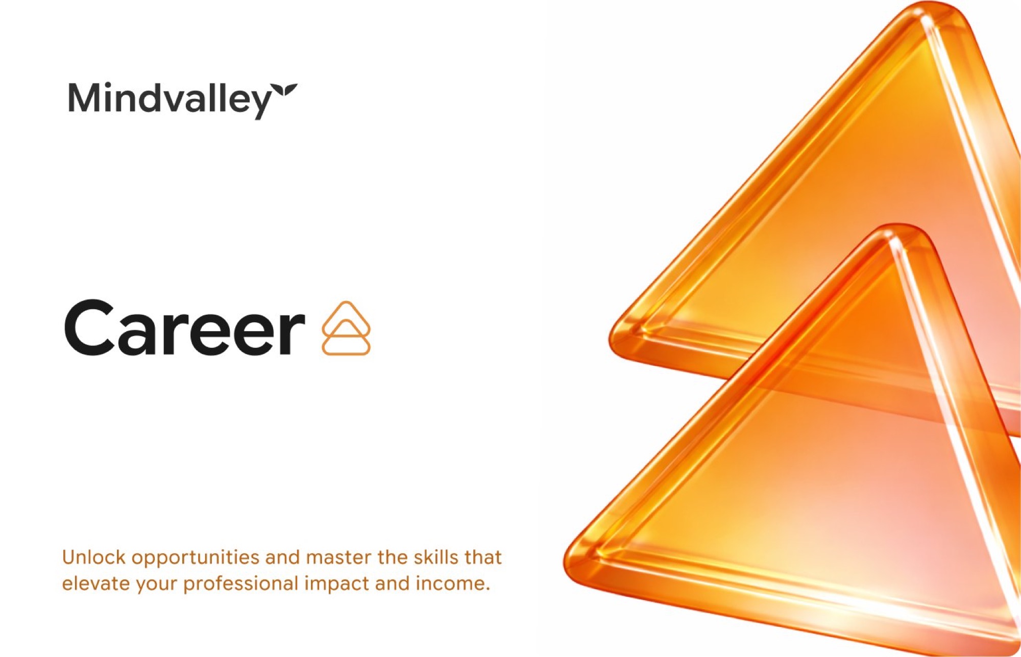
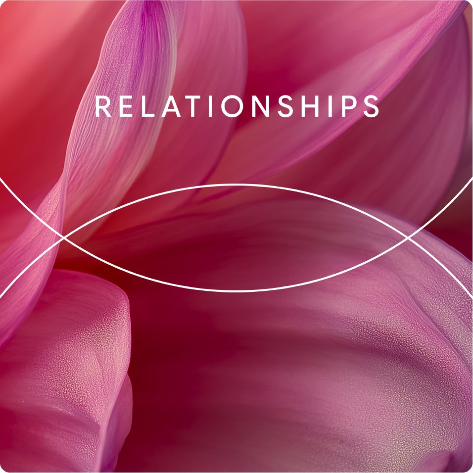
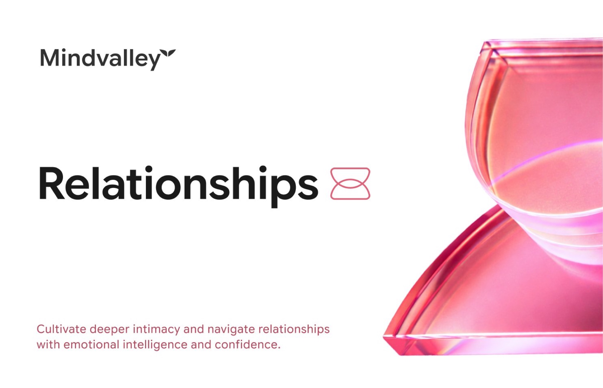
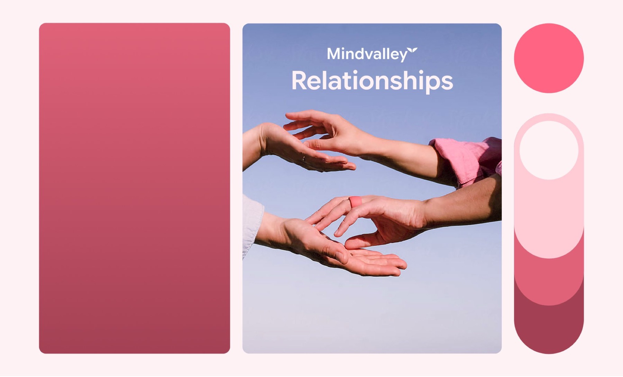
We consolidated the taxonomy down to five clear pillars, Relationships, Mind, Soul, Longevity, and Career, folding Entrepreneurship into Career. We gave each pillar one complete, resolved visual identity: a less saturated and signature colour gradient with a full extended tint and shade range, a single custom dimensional icon, a consistent photography direction pairing real, diverse people with bold pillar wordmarks. Where the old system leaned on abstract glass textures that could belong to almost any tech product, the new icons and photography are built to be unmistakably tied to their pillar and unmistakably Mindvalley.
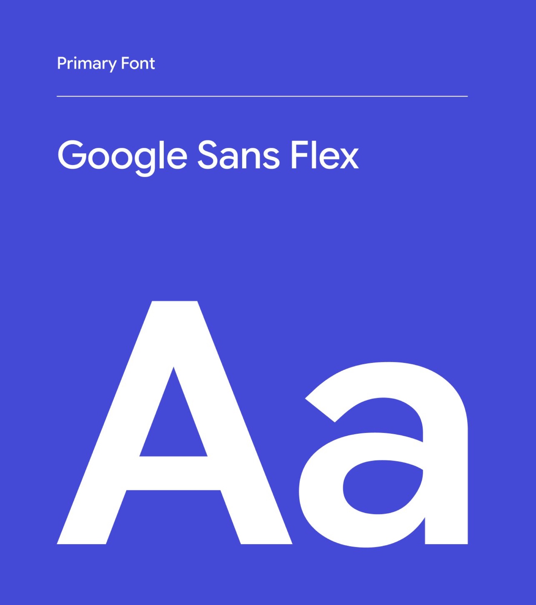
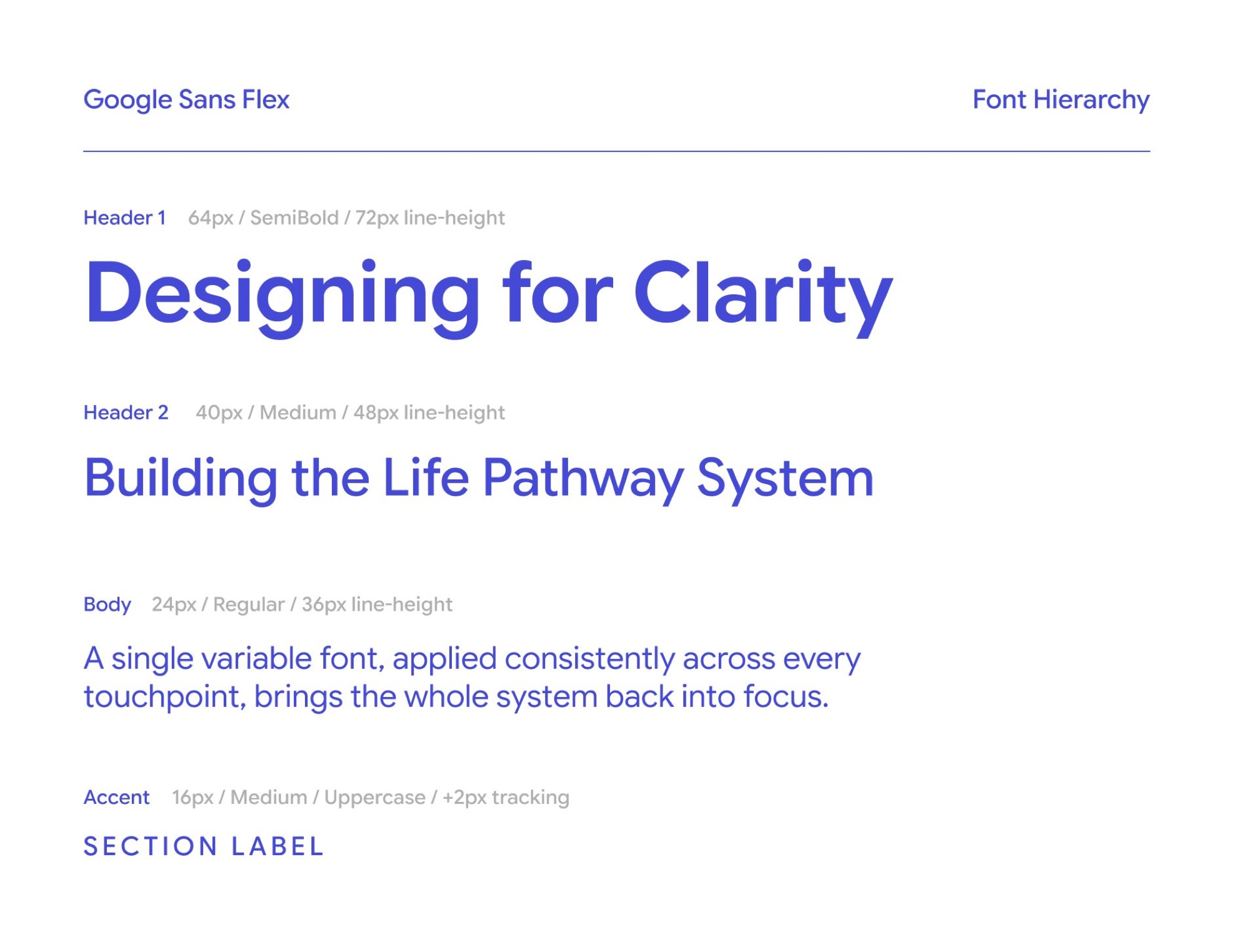
The same inconsistency showed up in type. Sharp Grotesk, the brand's primary display face, was being applied unevenly across web, app, and marketing: different weights, widths, and fallbacks. We standardised the system on Google Sans Flex, a font family that covers the full weight and width range Mindvalley needs, rendered consistently across all platform and outlets.
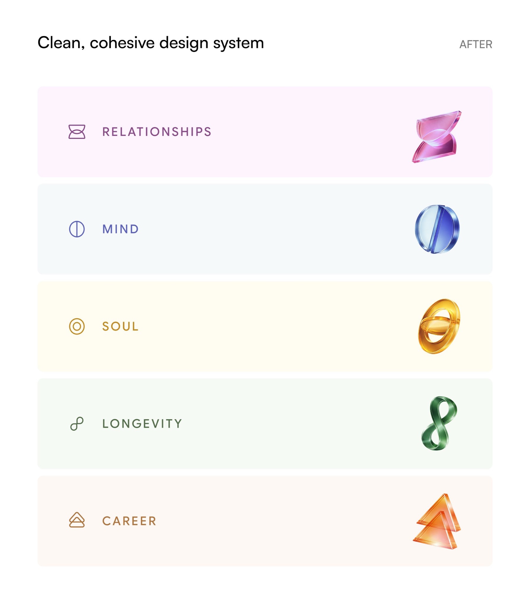




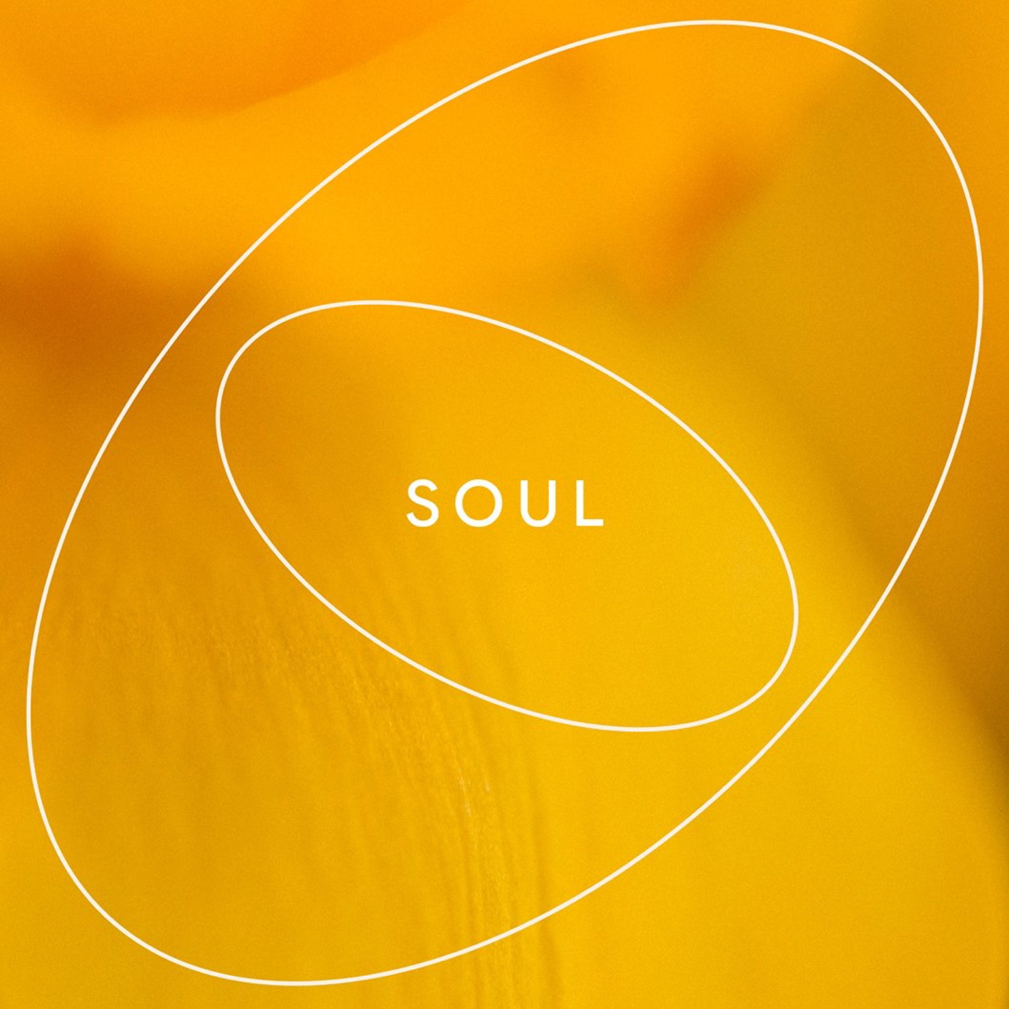
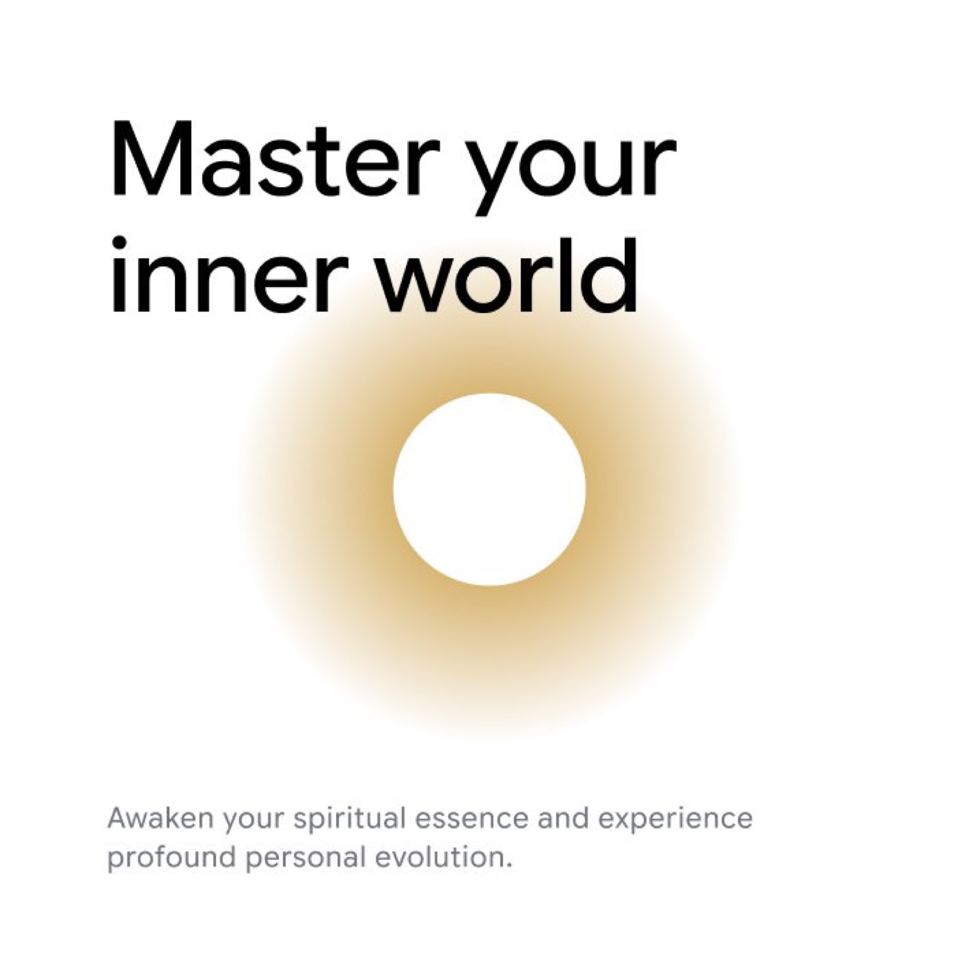
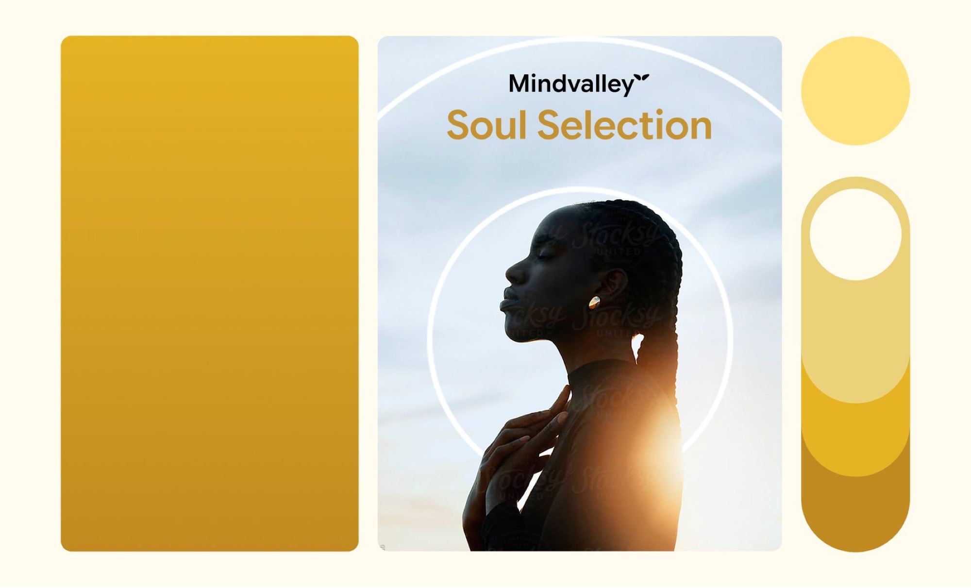

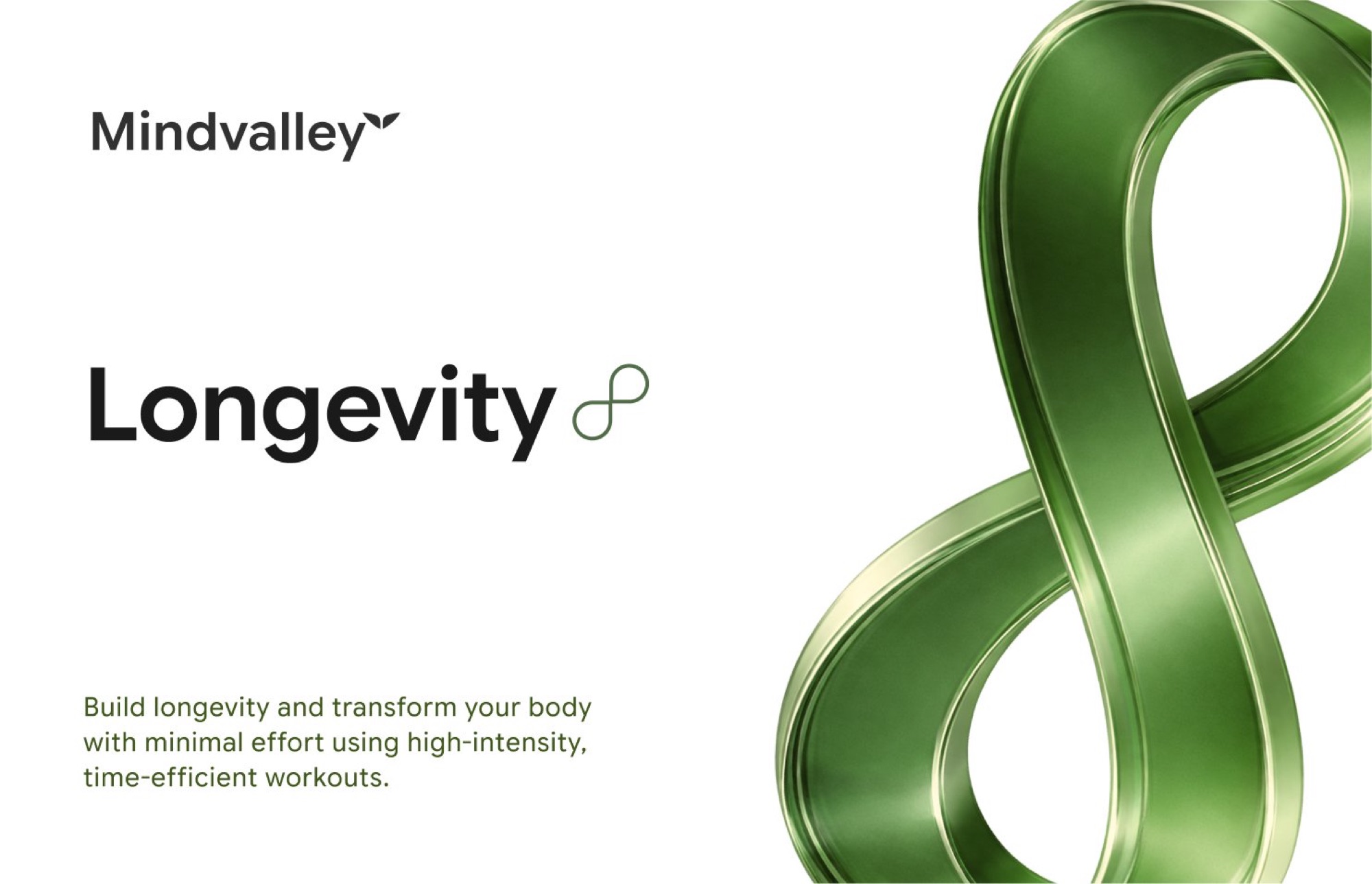
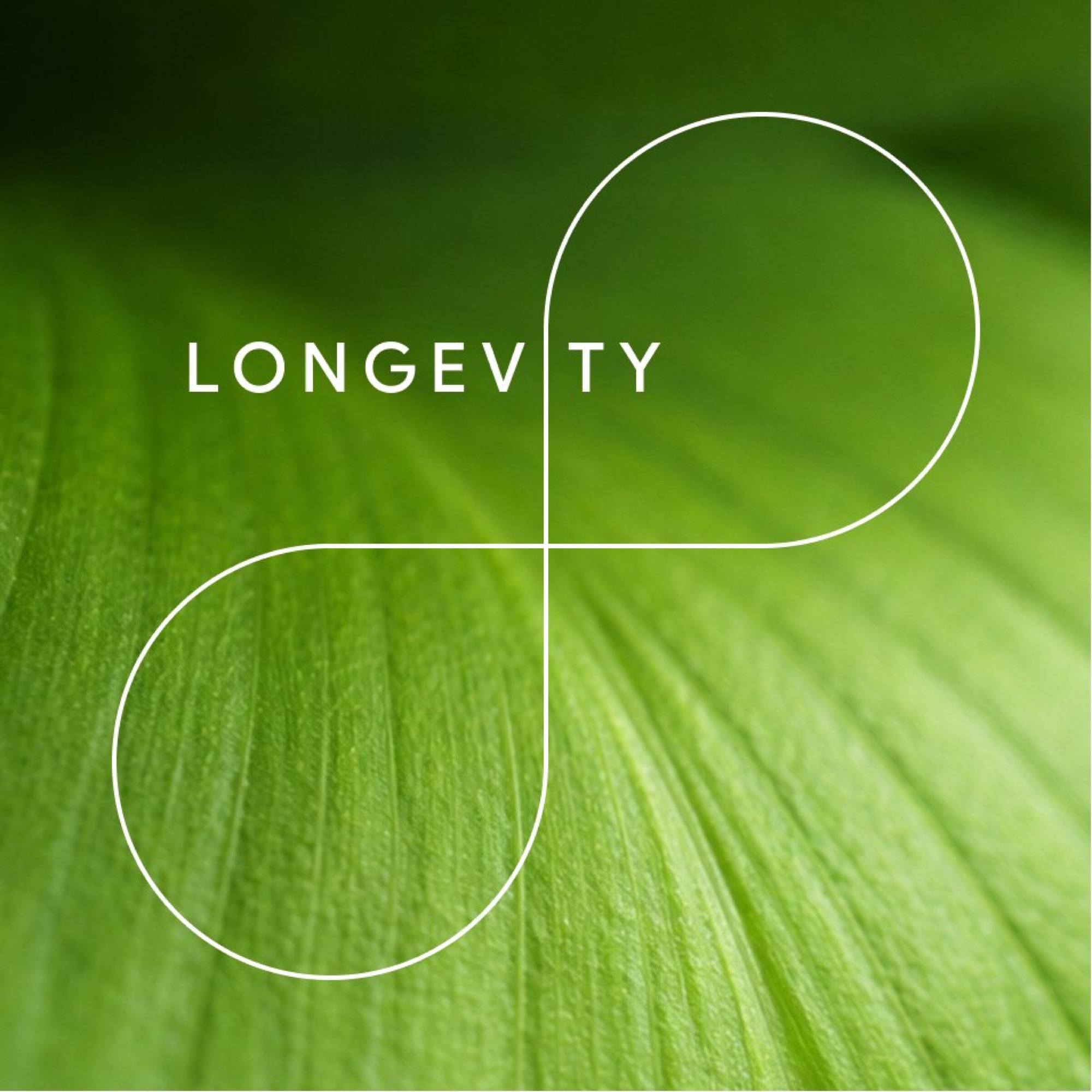
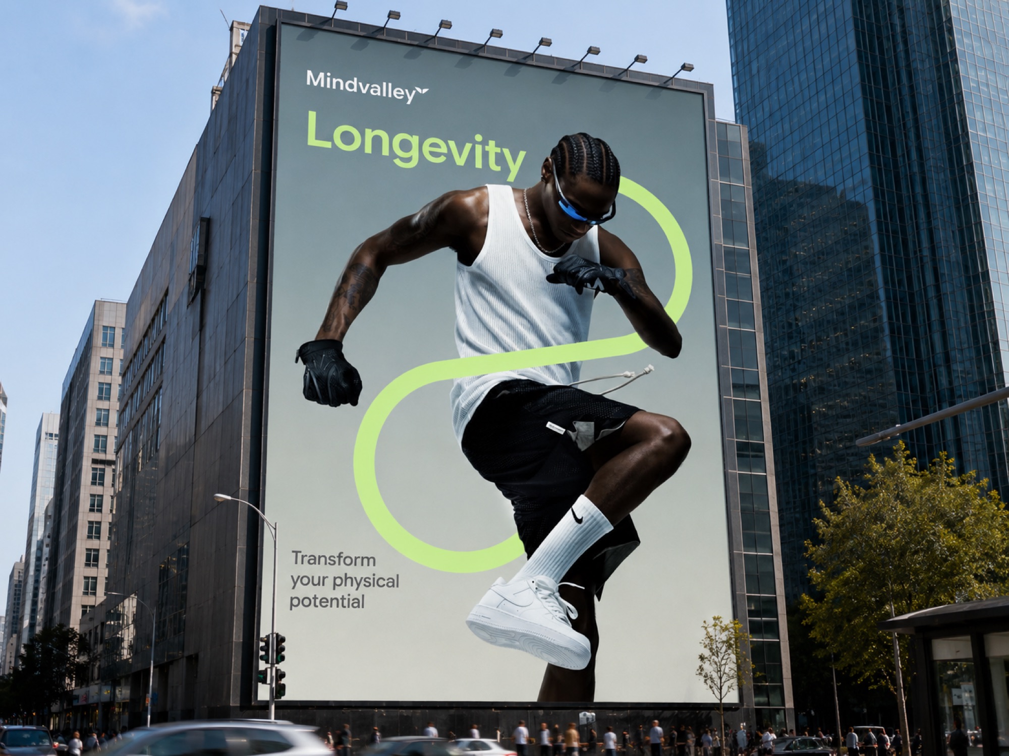

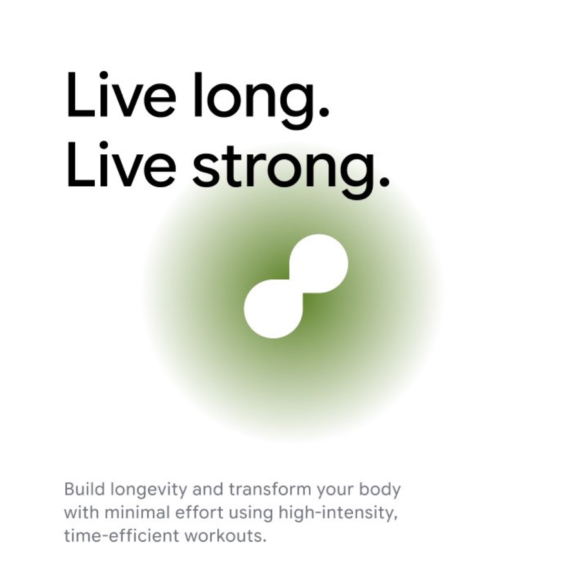

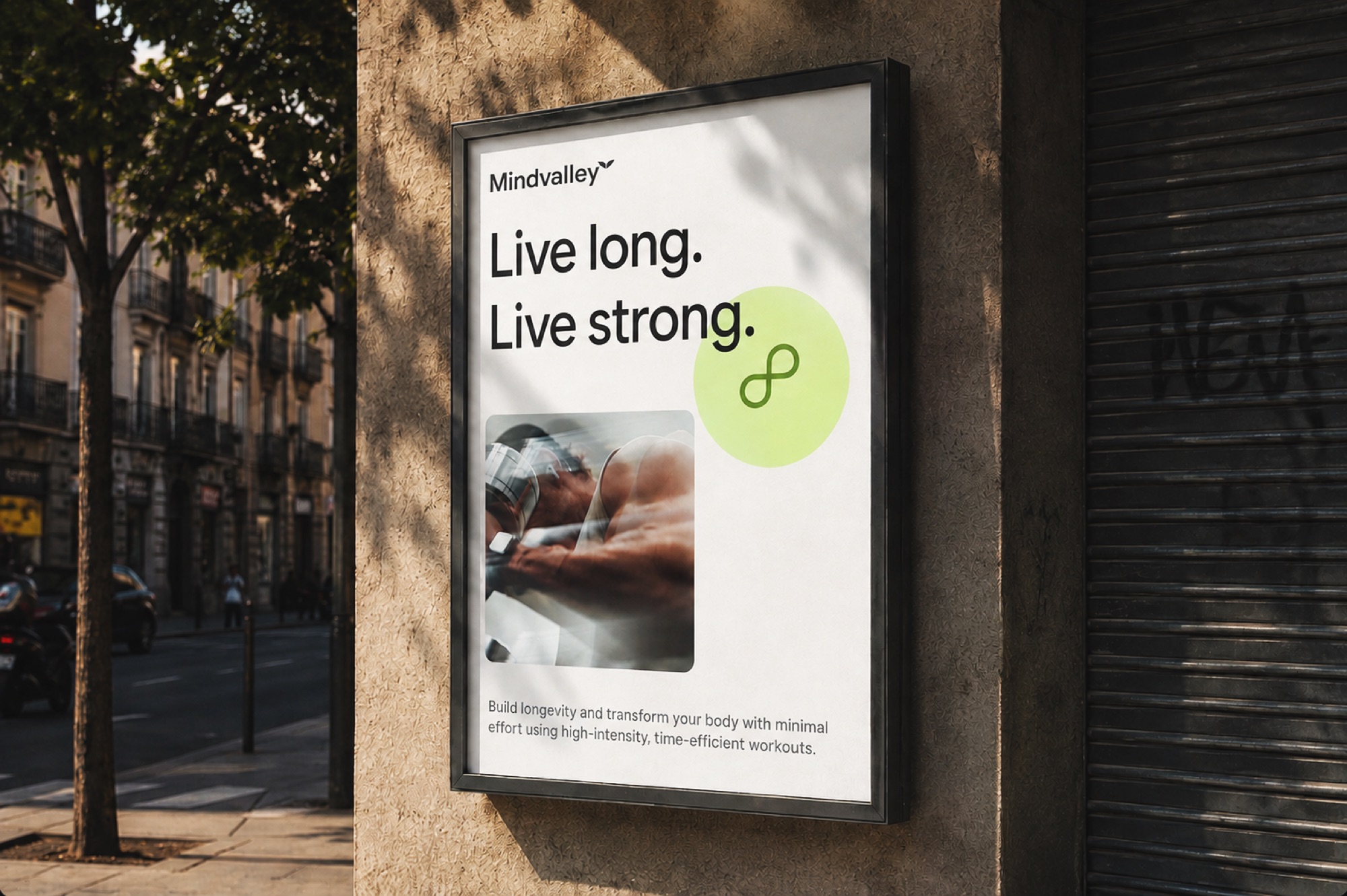

The result is a system with no open questions left in it. One icon per pillar, not two competing treatments. Five pillars, not eight overlapping ones. One photography and template language, not a mix of styles per category. A user scrolling the app can tell instantly whether they're in a Soul program or a Career one, purely from colour and form, and every new piece of content has a clear home to slot into instead of a design decision to make from scratch.